Analysing Thriller Titles - Ben
Rambo:
 I am doing the 2008 Rambo film mainly because I also analysed this film in my Thriller research post, but also because the title sequence is quick and goes by in a flash. Beginning with the institutional info, there are only two. Millenium films and Equity Pictures are the only two shown, with their logos flashing by the in the first few seconds, there is a sound bridge leading into the news report montage that I mentioned in the first research.
 After this montage, there's is the repeat of the institutional info. The font and colour fits someone who is on their way to break all the rules in the Geneva conventions. A dirty and rough Serif font in a deep red symbolising the blood of the East-Asian army the Protagonist is going to spill. As it is revealed on the black background that this is "A Film by Sylvester Stallone" the intro moves on into what I like to call: "This Is The Part Where We Show You The Bad Guy And Show You How Bad They Are" part, or TITPWWSYTBGASYHBTA for short.
 When the scene comes to a close, there is a short moment of total silence as we cut to the bad guy. The several string instrument Crescendos, building up to something that is about to drop jaws in the audience. As the violins and cellos peak into high pitch, the screen cuts to black and the title, 'Rambo' fades in with the red, rough font connoting blood and death. As it the title fades in, the violins are being drowned out by very loud wind instruments such as trombones. This brings the entire build up to a close by showing the audience what the build up was about. What follows is introductions of the Protagonist, Rambo, walking through the rainforest catching snakes as a living. The only text here is the actor's names in the same font seen before, but in white connoting everything is calm right now. The equilibrium before the disruption, according to Todorov's theory.
 This is very straightforward intro. Introduce the bad guys and MAKE SURE people know what they are watching. However, it also seems to reminisce in the past as the title font itself looks like an aged version of what was used in the original trilogy. What I do take from it however the contrast with the red and black and how the simplicity flows along in the sequence.
Mr Brooks:
Again going with what I know from my first research project, I am using this movie as a stark comparison against Rambo. A very calm and somber intro, but yet suspenseful and enigmatic. I would say I was very much inspired by this film as I love the use of colours, text, camera techniques and sound.

 The first institutional info is the iconic Metro Goldwyn Mayer lion. A sign of great movies and classics. Followed by 'Element Films' and 'Eden Rock Media', a rather long back screen is interrupted by a thud of what could possibly be am electronic drum kit. The text fades in and out of the screen with suspenseful music playing. I find this a perfect way to create enigma but I am unsure it could be implemented into my intro. What I find interesting is that it is only the one minute mark that the black screen fades away into the bathroom character introduction. The lighting, with limited use of the Fill light keeps everything dark and mysterious but also the orange, saturated tinge gives the film a very serious look with a pretty undertone. If there were stronger shadows I would almost say this is a Film Noir.
 One stark contrast between 'Mr Brooks' and 'Rambo' is just how much simpler 'Mr Brooks' is. Get all the institutional info out of the way first with no text appearing in the corner of the frame. No. Start with a black screen, show who is getting all the money and done! While the title in contrast with the rest of the intro. We are to introduced to Mr Brooks. A well off man with a few festering secrets. However, when he begins to speak out loud, everything does a U-turn. The edgy, suspenseful music stops and is replaced by calm piano and string piece. Instead of smooth and calculated camera movements (Focus pulls), It's a dissolve to a beautiful night city skyline. Now this change in pace is then used to show Mr Brooks family side. His happy life, open to the world, but this is very methodically planned. The piano is only there for a few seconds, but it calms everyone down. If not, the jump to psychotic murder in plain sight, to happy married, working man would be too much of a jolt. This creates a buffer of sorts, something which I might use, should I continue my story past the intro.

Reservoir Dogs:
Going with something different now that I did do in the original research project, the Crime Thriller, 'Reservoir Dogs'. This is a very long opening sequence. It's only 8:43 that the title shows up and before that it's only two scenes. But begins simple with the institutional names, not logos. This was in 1992 however and there was no fancy CGI sparkles, but Paramount still had stars appear. I believe the logos are not included is not to retract from the film. We can see just as easily who made the film with one line of text on black screen. This also helps to introduce the first scene with a sound bridge. The sounds of a diner or cafeteria crescendos gradually and then cuts into the film soon after the first bits of conversation is heard.

 This scene serves to introduce the characters as they have conversations at breakfast looking fine in their suits. Conversations vary but are in general somewhat crude which, along with the suits and smoking, are all stereotypical of criminal mobsters. The camera moves behind the characters and around the table, changing focus as the conversation did. By this I mean each conversation had a leaders that drove it and the camera would focus on them. Camera shots varied from Over The Shoulder Medium Shots to Big Close Ups and Medium Close Ups. This give the audience a very personal start to the characters, as if they are at the table too, among this group of friends and colleagues. Also for most of the shots, the camera is moving around the table, following who speaks, rather than a static frame.
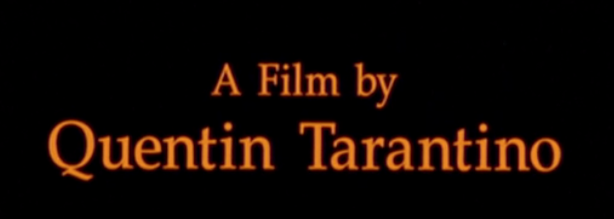
 Once the group decides to stop breakfast and character introduction, they walk out the cafeteria with some swinging 70's beats. We discover the film director with a short black screen to transition into the second scene, a badass walk, in slow mo, with music that without the name I could only describe as the slickest Jazz-Rock I've heard. This walking scene goes to every character, showing the actors's names at the bottom of the screen. The title is different from all the other text already shown. That was static. The title slid up from the bottom to the the top. Pandorum has something similar only it moves from behind the camera then away. But as the the Dogs keep walking towards what doesn't look like enough cars for them all, a small credit section for key people who worked on the film and then sounds of a screaming man crescendos until it cuts to a bloody scene.


 What to take from this film introduction. Being long can help with character development, especially when the plot is for the characters to solve a mystery. But also placing such long winded credits just to seemingly stretch the song out seems unnecessary. However, a sound bridge like this could be used in the buffer I mentioned in 'Mr Brooks' to help facilitate transfer. This almost seems like a reverse from 'Mr Brooks' where it went from somber to cheerful, this goes from "We're going to do crime" cheerful to "I'm bleeding to death on the leather seats" somber.

This is a good start Ben - level 3. You need to add 2 more as you know. Can you also add evaluative comments that will connect these sequences with your own plans? What do you like, what could you take forward etc?
ReplyDeleteBen - have you done the other 2 yet? I can't see them. You must do these by midnight tonight if not.
ReplyDelete